The Concept
Seatopia is a kids' park that provides a range of entertainment options for kids, from interactive activities like a map-guided treasure hunt and a coral maze, to traditional activities such as slides and carousels, enhanced by character enactments and an educational petting zoo that teaches about sea species and environmental preservation.
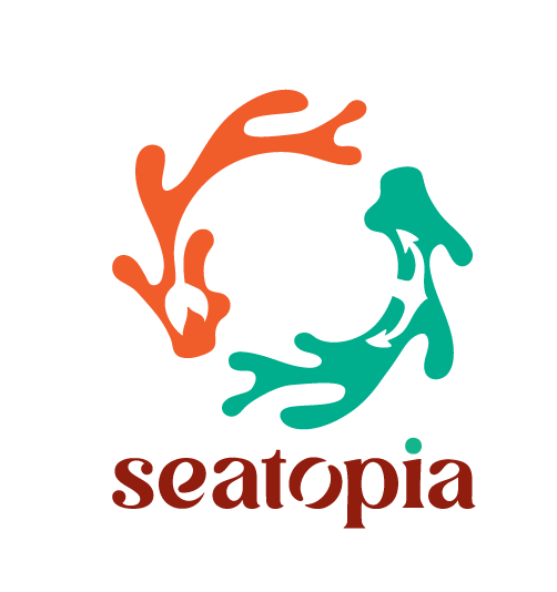
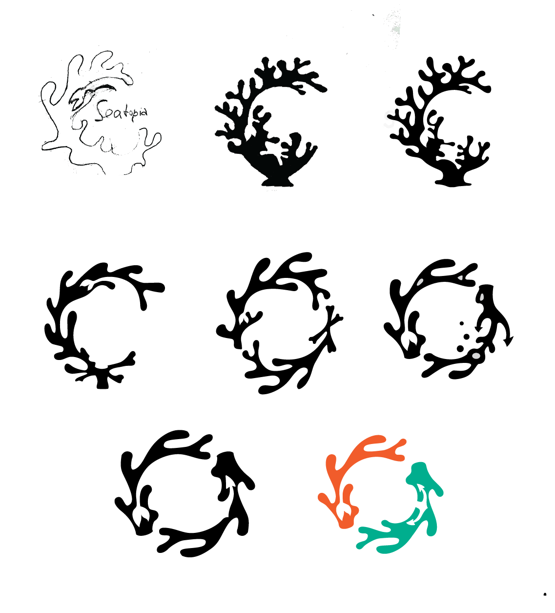
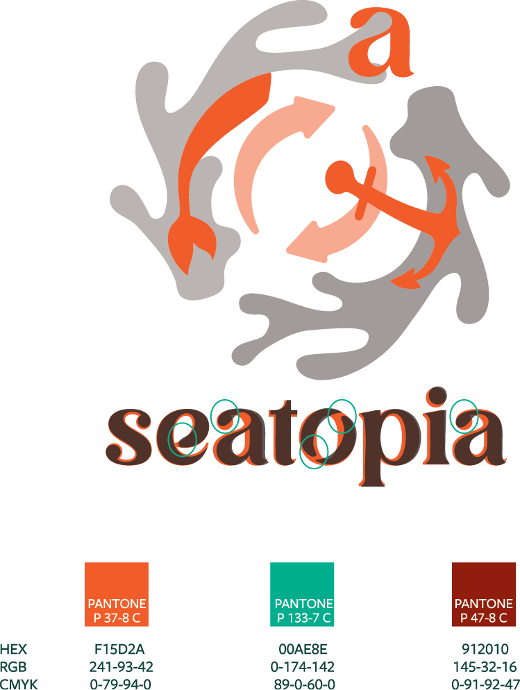
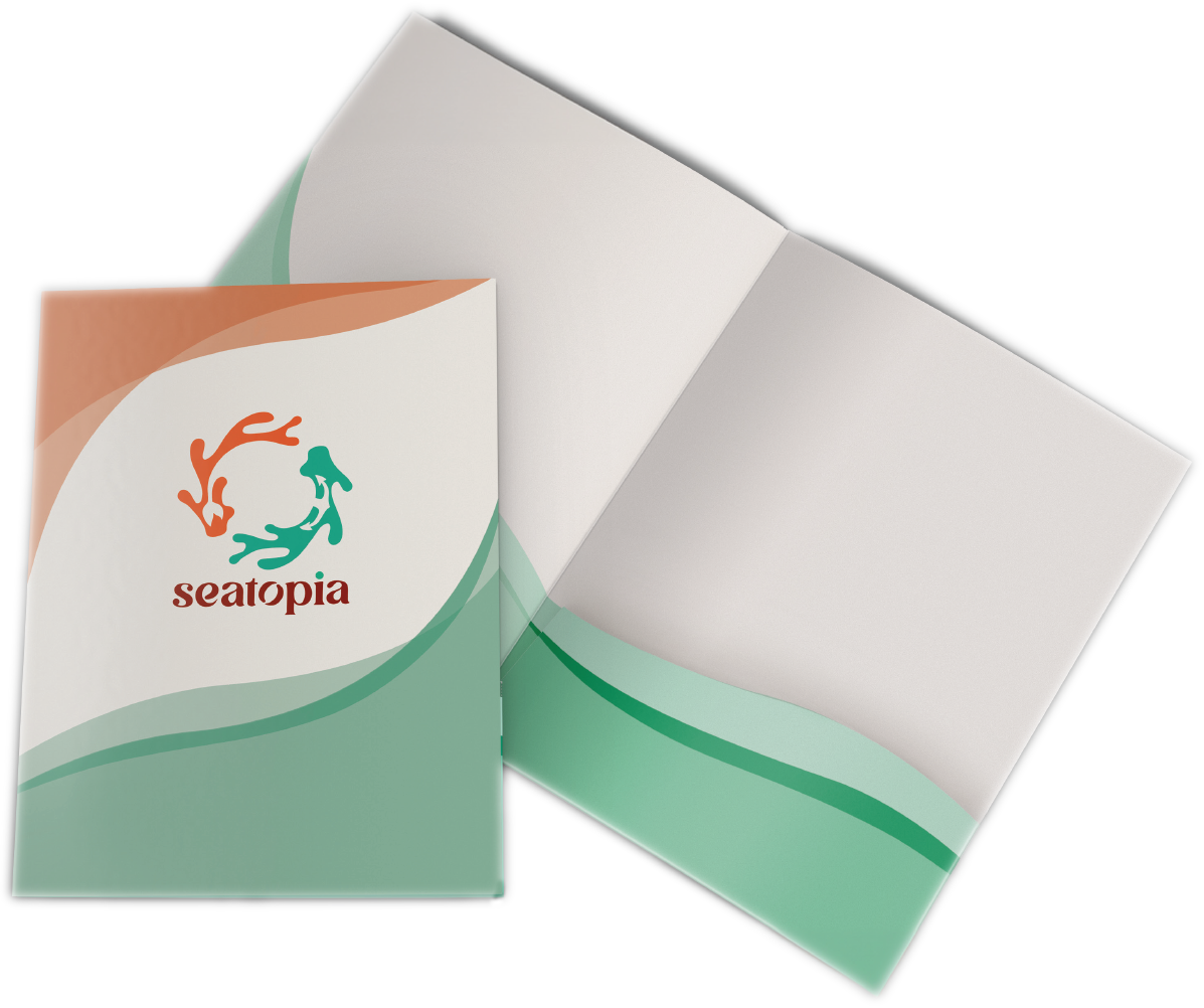
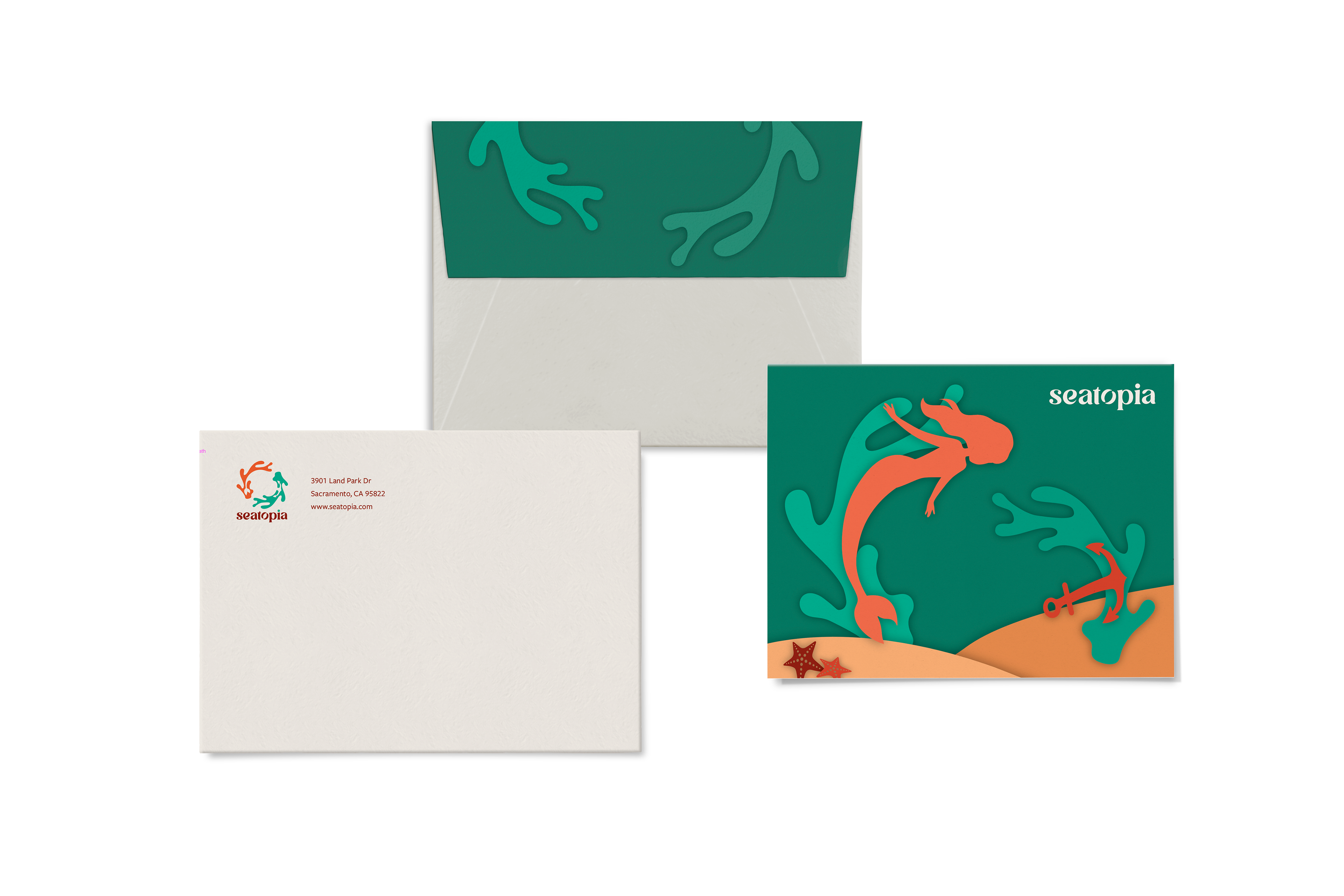
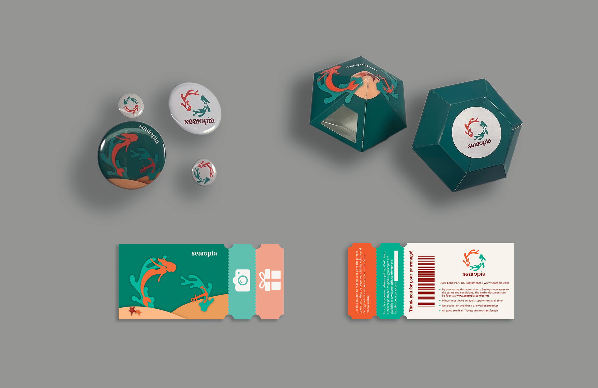
While designing the mark for the park, the main goal was to encapsulate its distinctive themes—sea creatures, sustainability and preservation, and pirates and mermaids. The mark features a circular shape reminiscent of a recycling symbol, emphasizing sustainability, and incorporates stylized coral reef elements to represent environmental impact. The clever use of white space integrates a mermaid's tail and an anchor, aligning with the underwater theme. Typography adjustments were made to the Avigea typeface to align it with the park's aesthetic, including modifying letters to echo visual elements like coral reefs. The color palette—orange for energy, blue-green for the sea, and dark-red for adventure—was chosen to reflect the park's vibrant and educational environment.