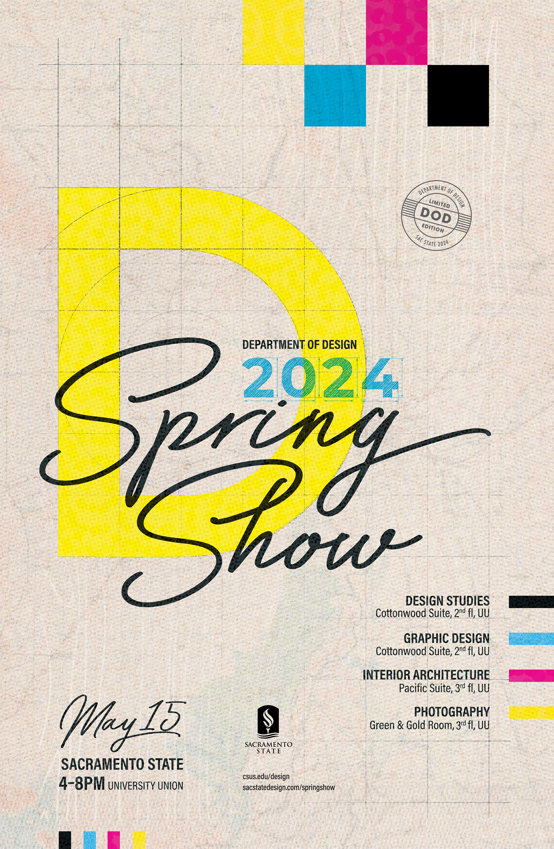
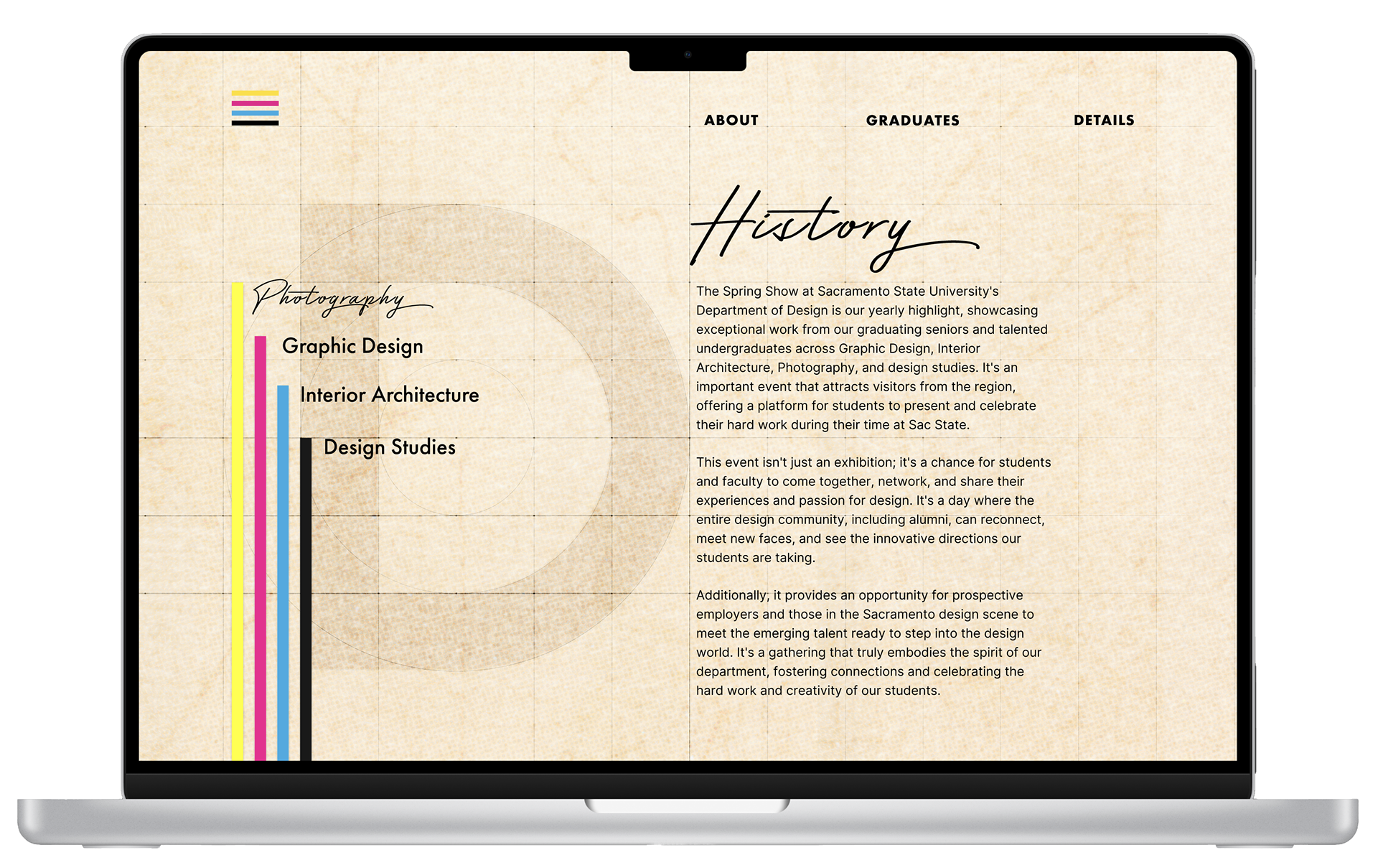
The Concept
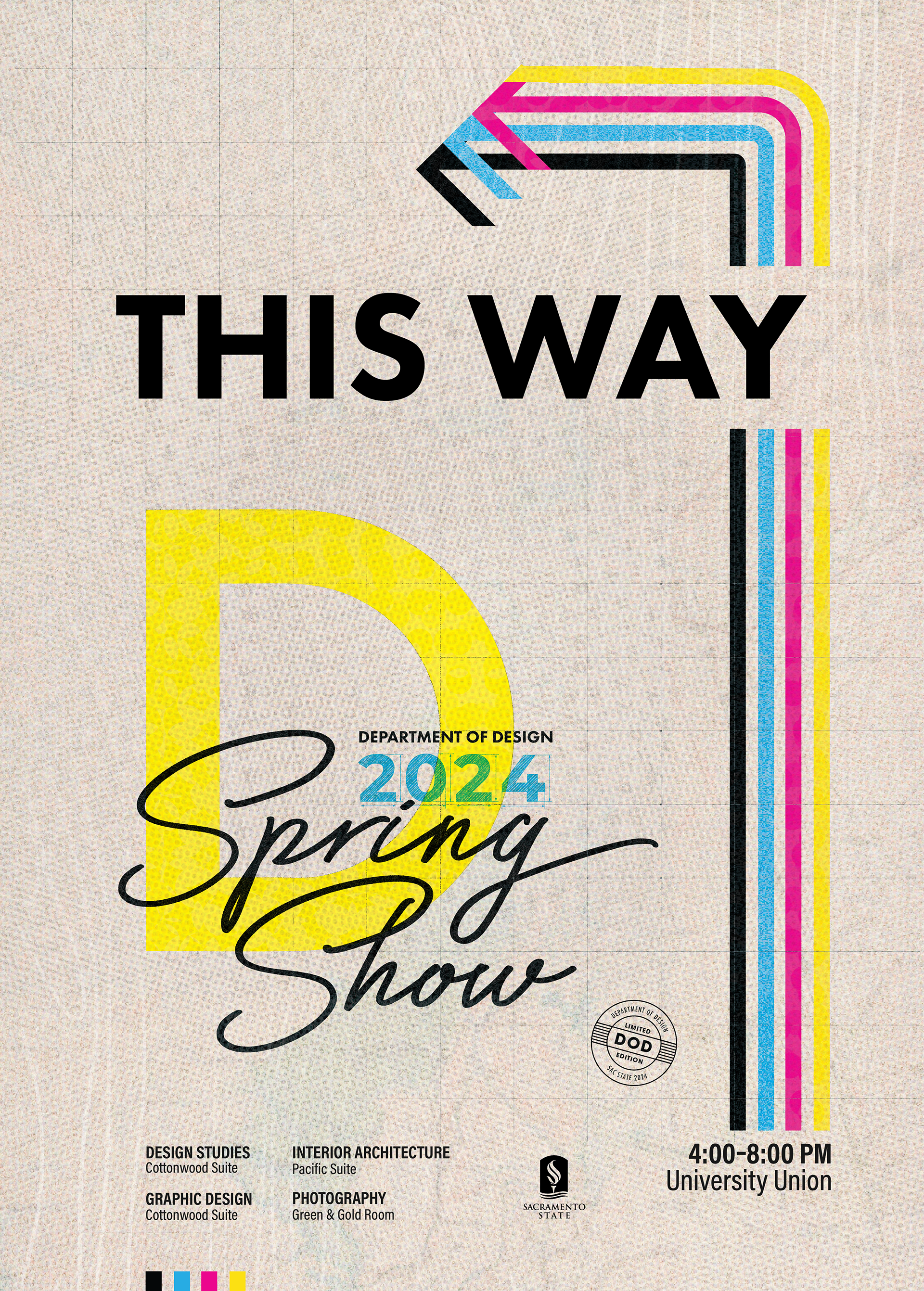
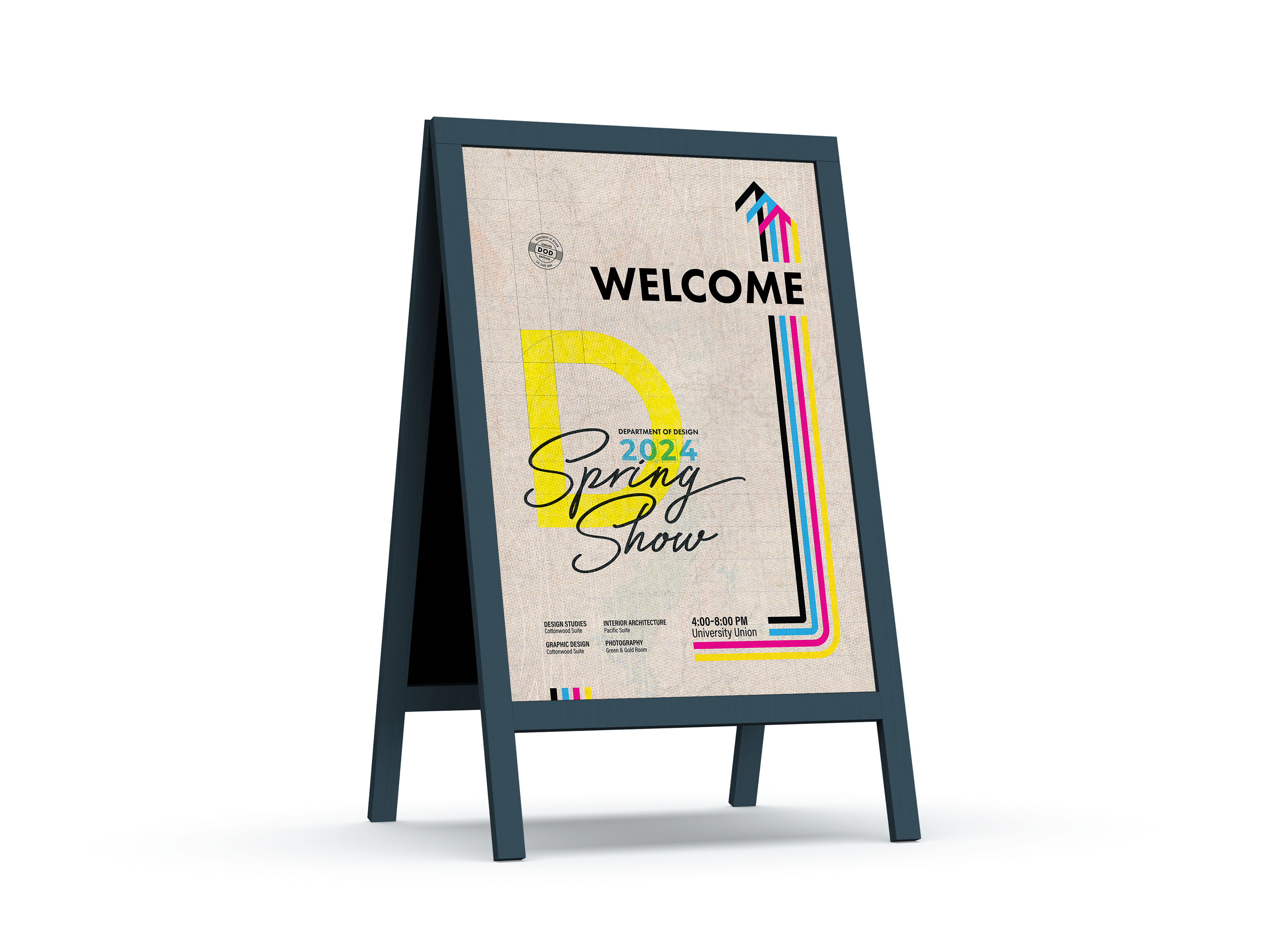
This concept is rooted in a variety of design principles we learned and practiced throughout our educational journey at Sac State. First of all, the four-color process is near and dear to every designer’s heart. In this case, it also represents four departments. The poster repeats them a few times and each time it serves a different purpose—introduces the system, represents what color is attributed to each department, and draws viewers’ attention to the important pieces of information.
Secondly, a simple grid system was used to signify the importance of meticulous layout and composition, and in general, attention to detail. It also harks back to the history of the design program and honors the GRIDS club that so many designers, starting and mature, have a special appreciation for.
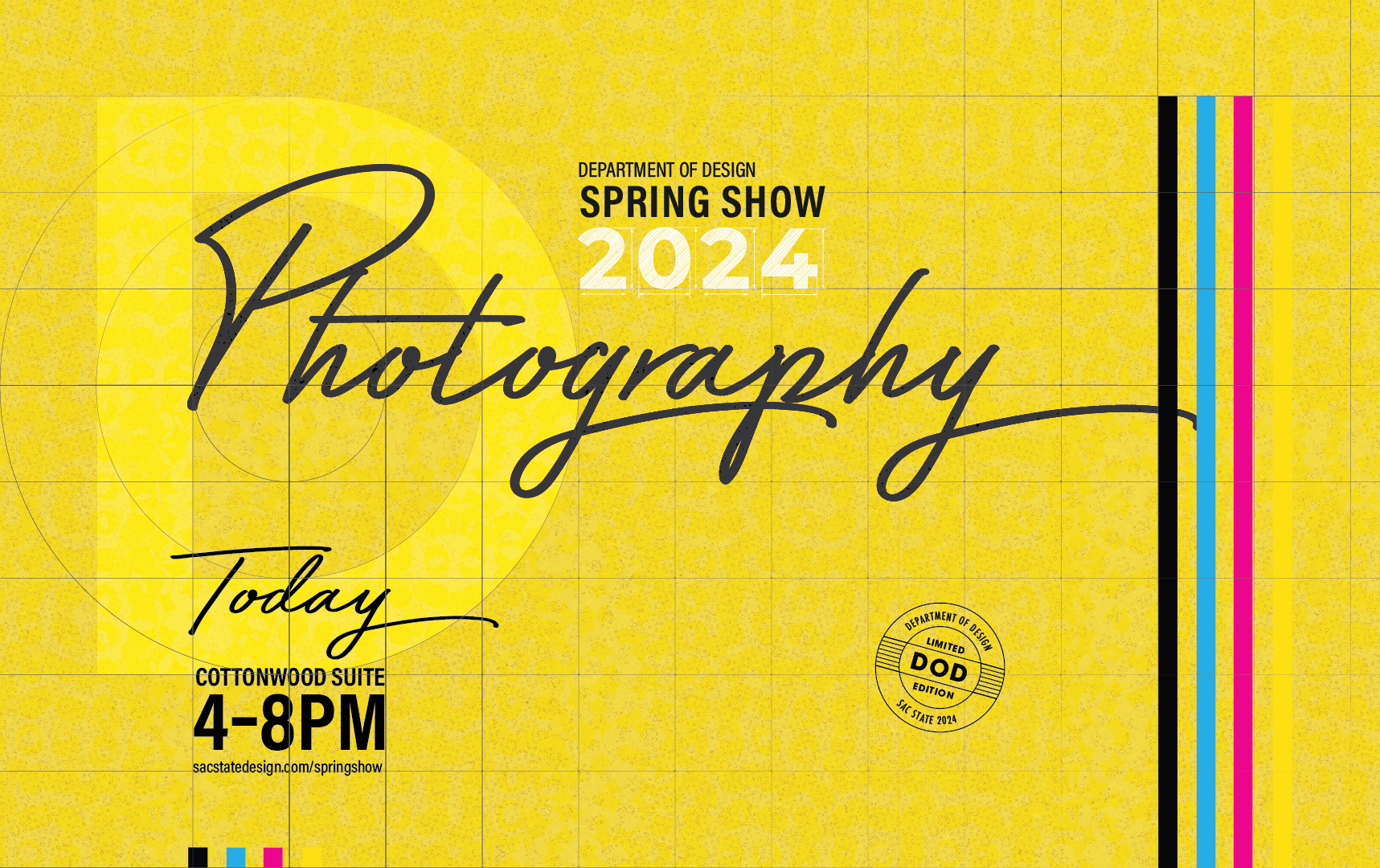
The rich history spanning two decades is embedded in the typeface choices—a cursive, retro typeface Bayshore, and a classic Futura, as well as in a circular DOD mark that was used for some earlier event identities. The year represented with the hand-drawn-like letter is referencing craft and seemingly mathematical precision.
The background is composed of a few layers that add to the visual complexity and interest of the composition. The light brown color comes from a craft paper background to represent craft and a hands-on approach towards solving visual problems. An overlay made of a halftone texture is referring to the Photography program, and a subtle wood texture adds an organic form and is meant to represent Interior Architecture.
Finally, one of the key words for this concept was “context”. As designers, we want to offer meaningful solutions that solve a particular problem based on prior research. A Sacramento map peeking through the design is tying it all together to our Alma Mater.
By adding a variety of elements to complete this concept, my goal is to communicate a journey of a designer through the programs offered by the Design Department, the skills and process we pick up along the way, and the rich history of the highly-anticipated event for the local creative community.
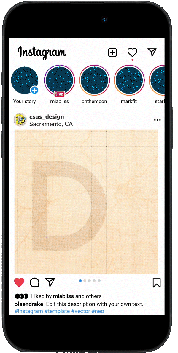
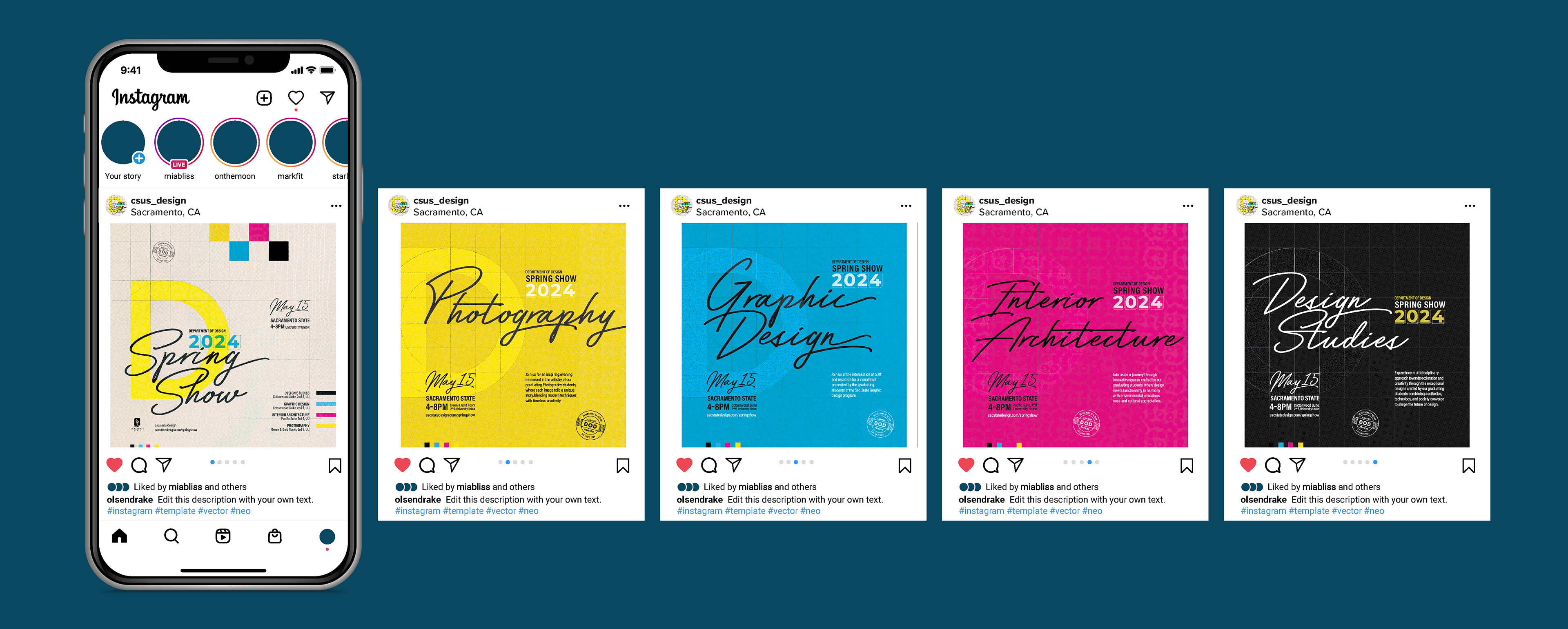
Digital Solutions
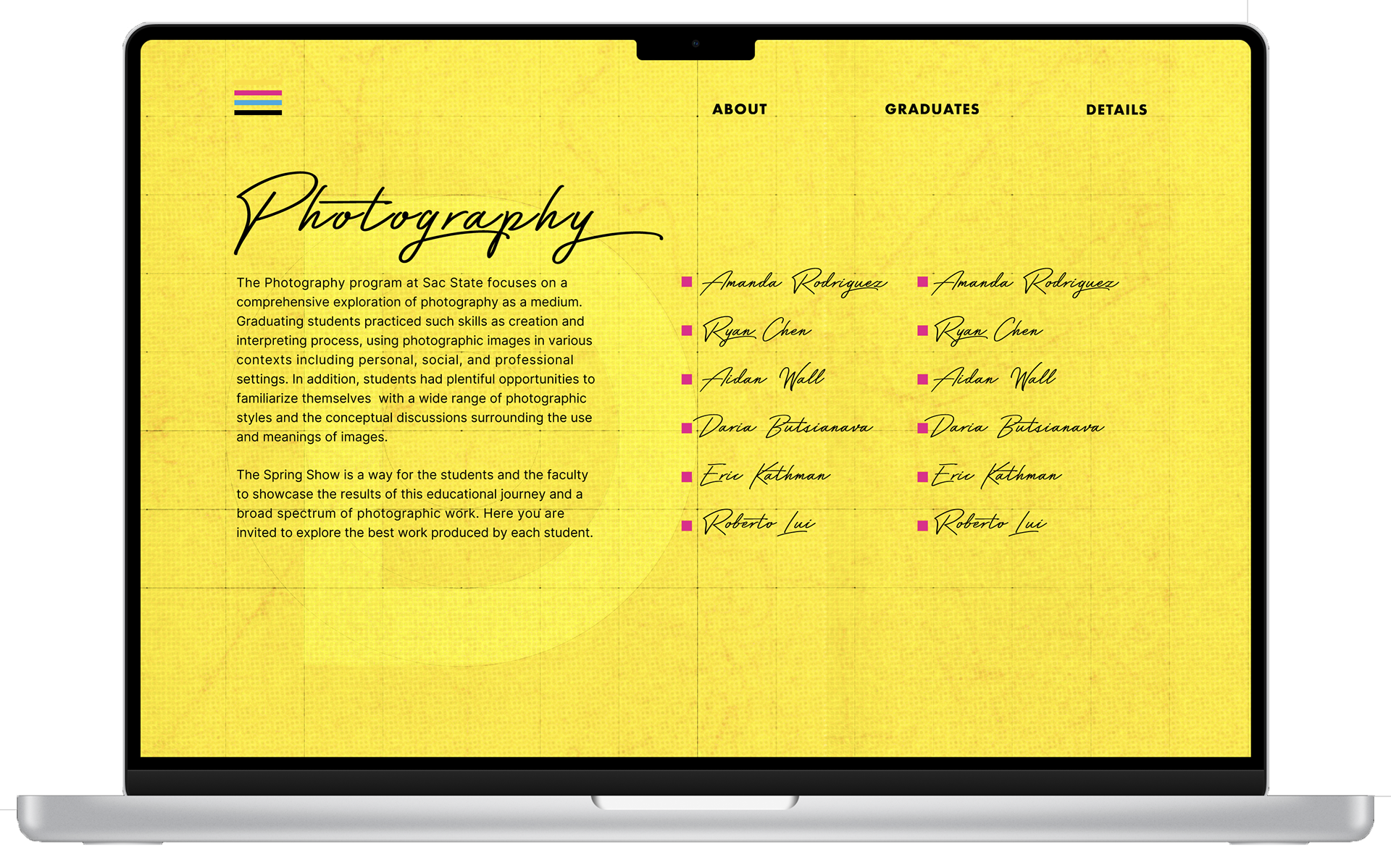
The marketing collateral included a "save the date" social media post and a matching Instagram story. The animation introduced the 2024 concept, showcasing the color scheme, typefaces, and the signature yellow letter 'D'. The main event features a carousel of five posts, each highlighting one of the four design programs represented in the 2024 Spring Show. Colors from the original poster are used consistently throughout the campaign
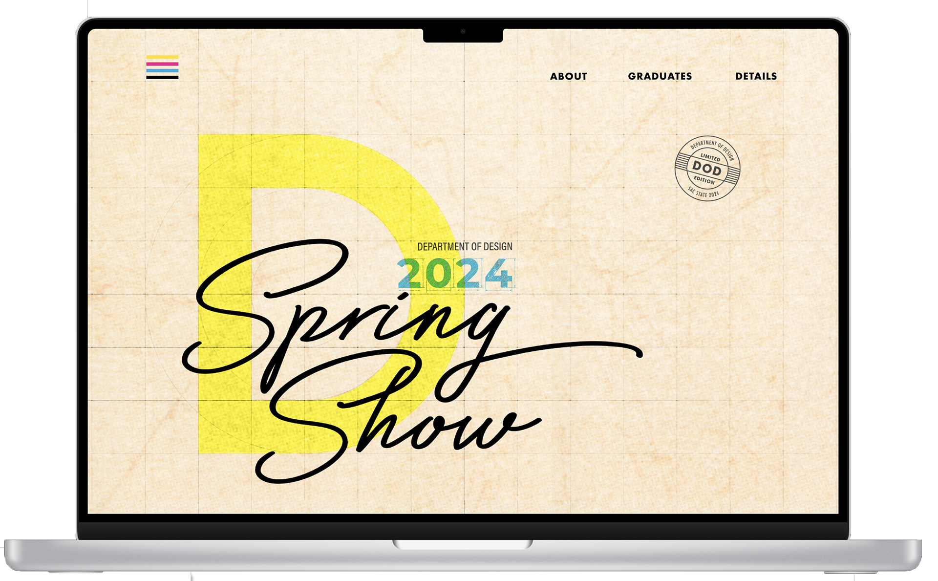
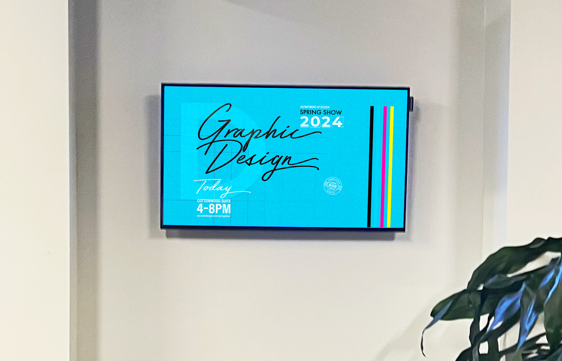
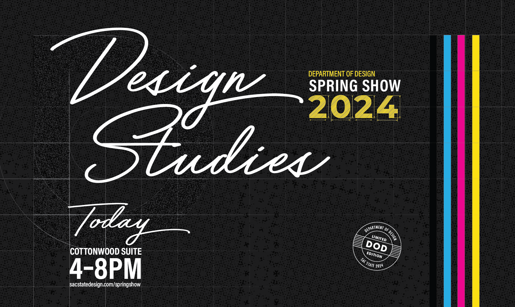
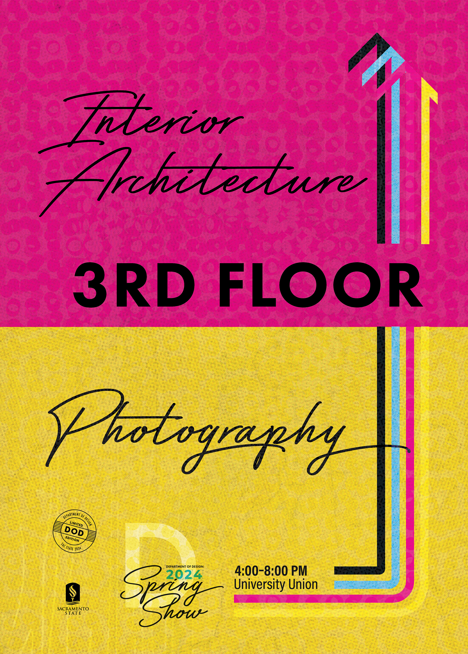
Wayfinding Solutions
To help guests orient themselves on the event day, I developed a signage system using elements from the main concept. Directional signs feature colored lines turned into arrows. Similar to the social media graphics introducing each design program, digital informational signs at each showroom entrance represent the respective departments.

Things to Remember
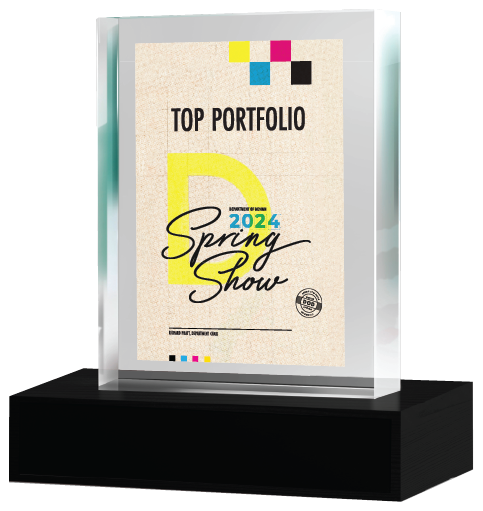
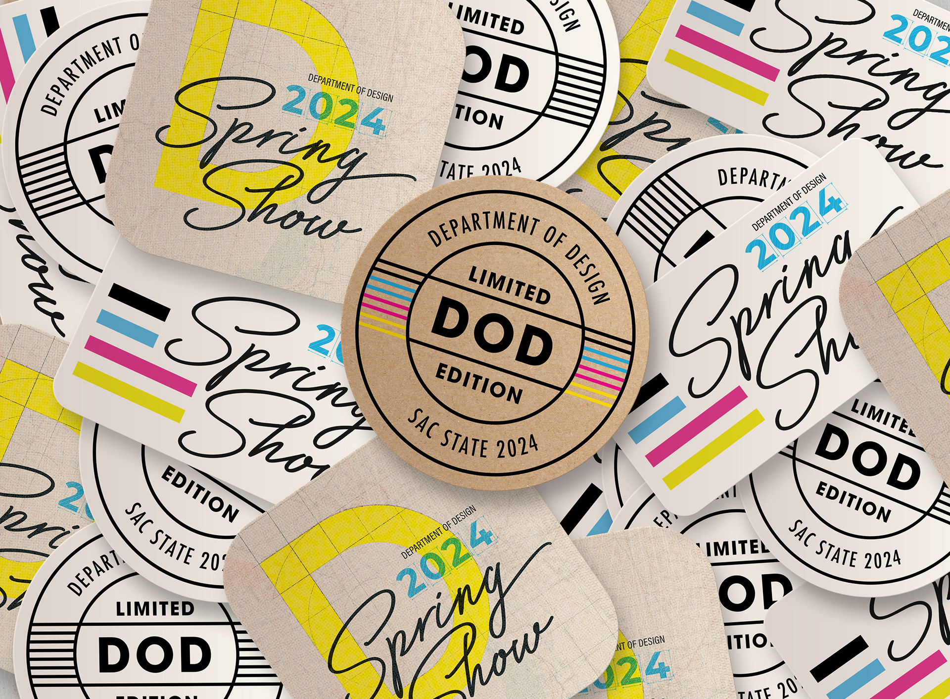
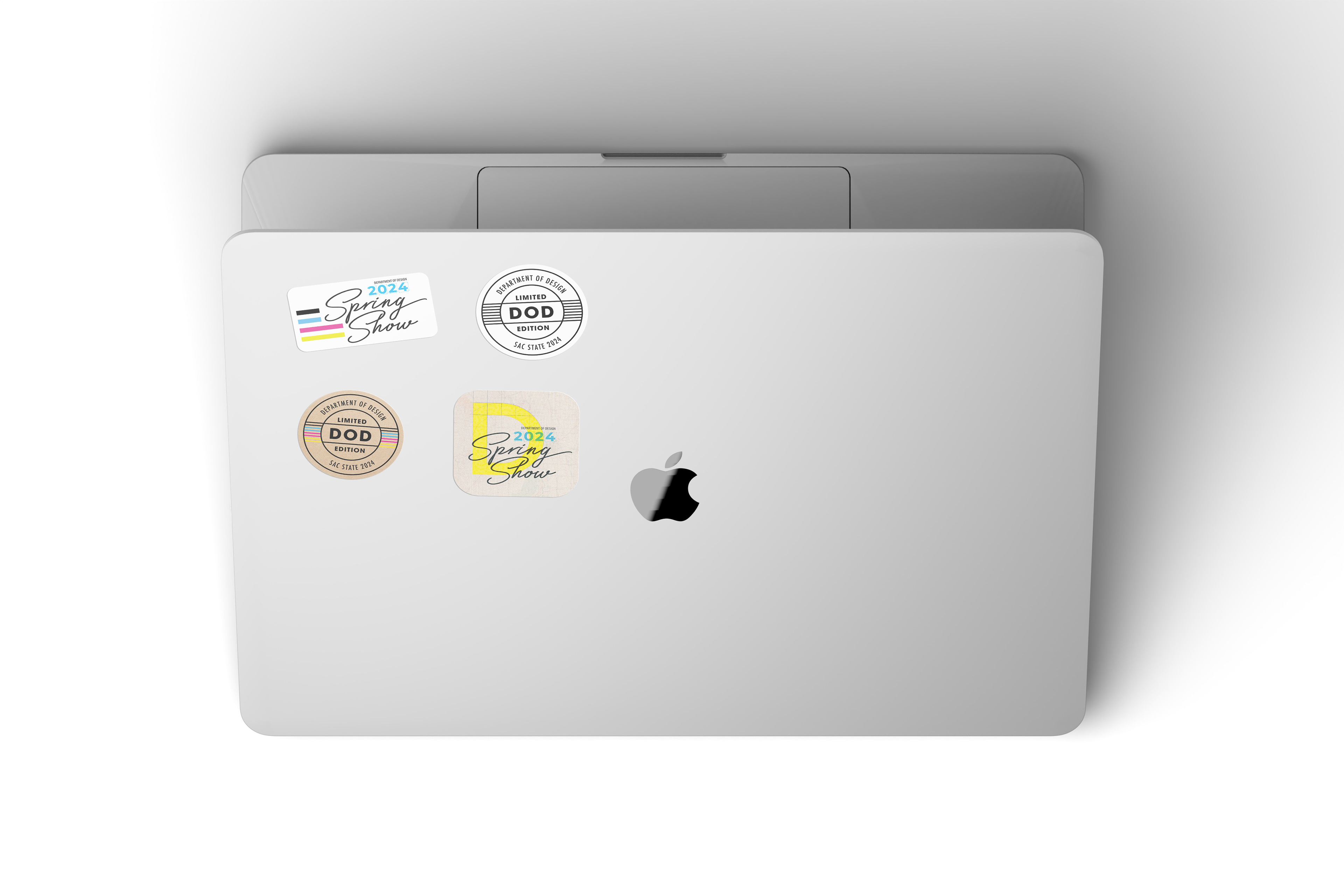
Guests and designers were able to take home stylized stickers, as well as some lucky winners scored a trophy to remind them of the accomplishments.