Varsity Marketing Collective
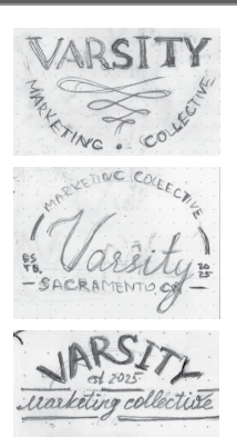
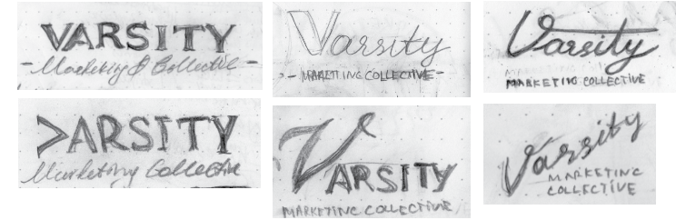
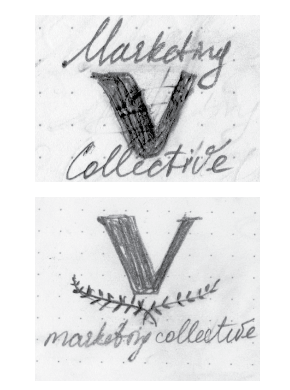
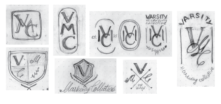
Varsity Brand was created to support marketing efforts. The client was interested in a typographic mark that was elevated, simple, and had a contemporary feel rooted in classic elegance. With the brand's goal of focusing on bringing exclusive services to high-end clients, the inspiration came from luxury lifestyle brands, tennis clubs, and timeless aesthetics.
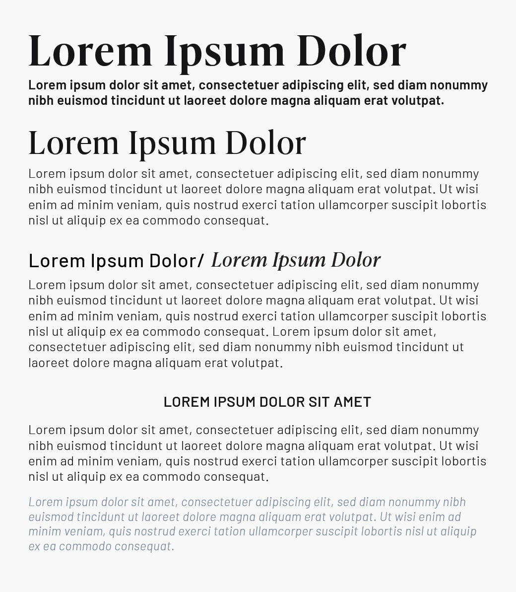
After the research was complete and sketches were presented, there was a clear direction to focus on selecting the typeface that best represented what the client wanted. It had to feel contemporary but still have old-school elegance. It had to work in both the main mark and the circular monogram. It couldn't be too heavy, but the stroke contrast also had to be just right to have sophistication while remaining legible.
Between the color palette and serif font, the challenge lay in finding the balance of not making the mark look dated but also not leaning into a trendy direction. The selected serif provided enough contrast to feel luxurious, while its proportions and restrained details prevented the identity from feeling overly traditional.
The addition of a monogram is a great way for a brand to be fluid and versatile. The solution with the brand's name encircling the initials is concise, contemporary, and grabs attention.
Overall, the brand communicates exclusivity, confidence, discretion, and established expertise.



____________________________________________
California Airports Council
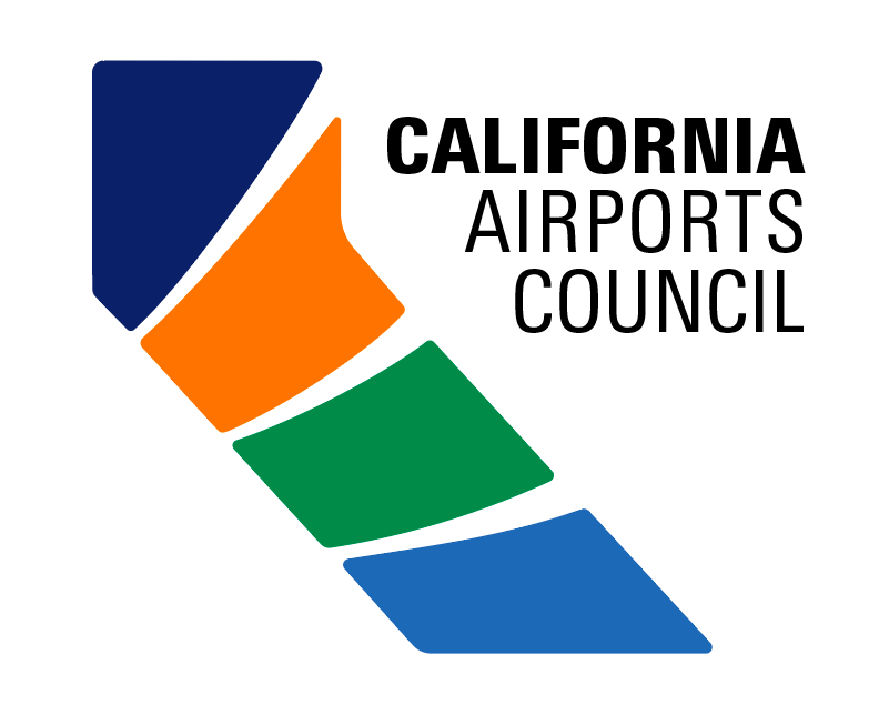
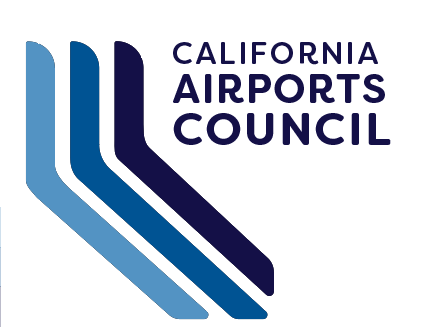
To successfully solve the branding challenge, the identity needed to suggest aviation without relying on traditional industry imagery such as aircraft, globes, or control towers. The client was also interested in exploring concepts that incorporated a sense of California, while emphasizing the organization’s commitment to sustainability and green initiatives.
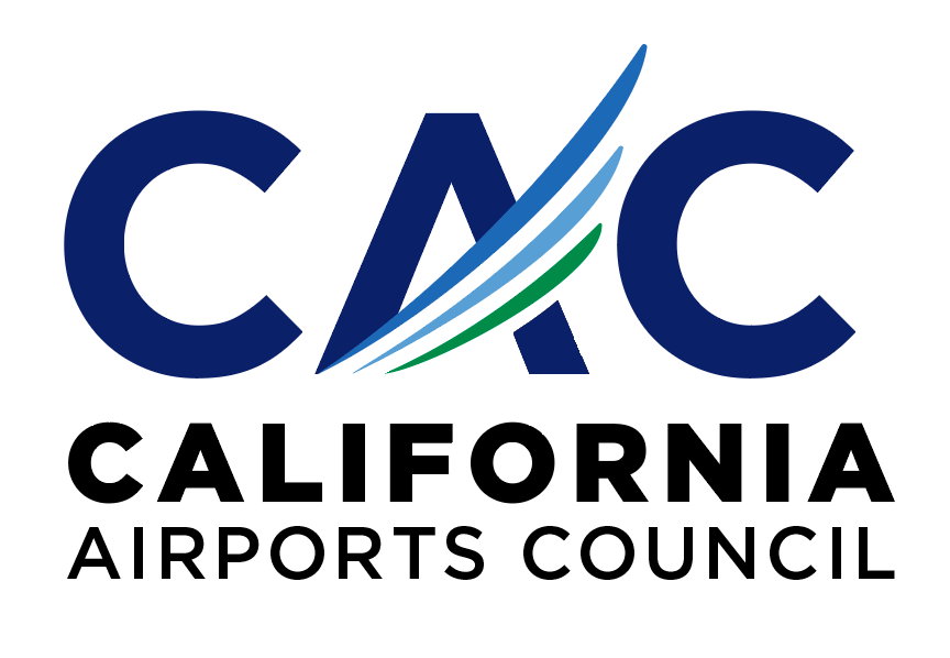
Several concepts were explored, with the selected direction using sweeping lines that trace across the letterforms to convey motion and progress. Inspired by the trails of aircraft in flight,
the lines create a sense of direction, continuity, and connection. The addition of green reinforces the organization’s focus on sustainability and its ongoing green initiatives.
Together, these elements create a contemporary identity that communicates movement, connection, and forward progress while maintaining a strong connection to the organization’s role within California’s aviation network.

________________________________________
The Grace
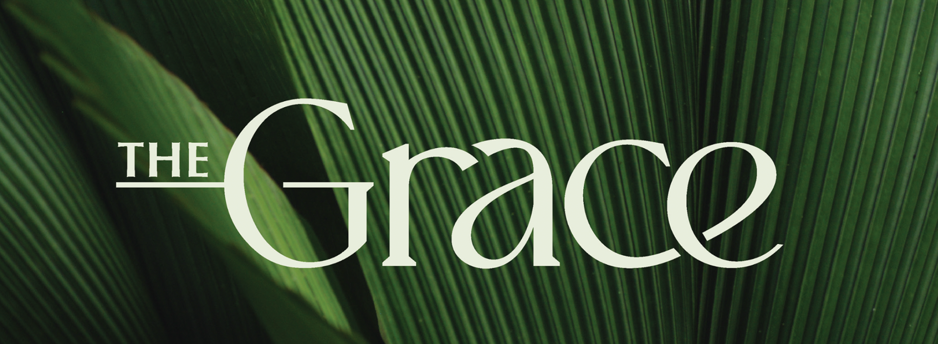
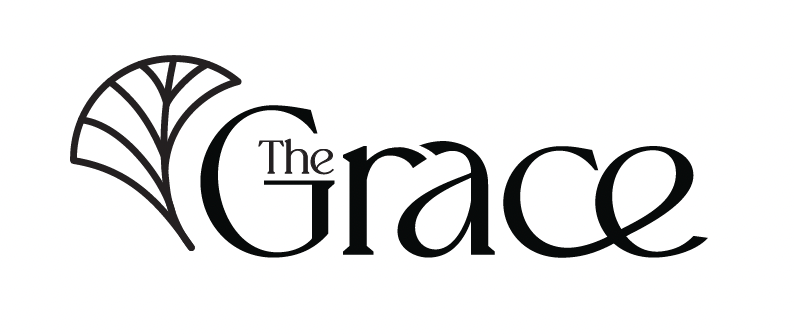
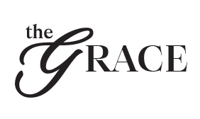
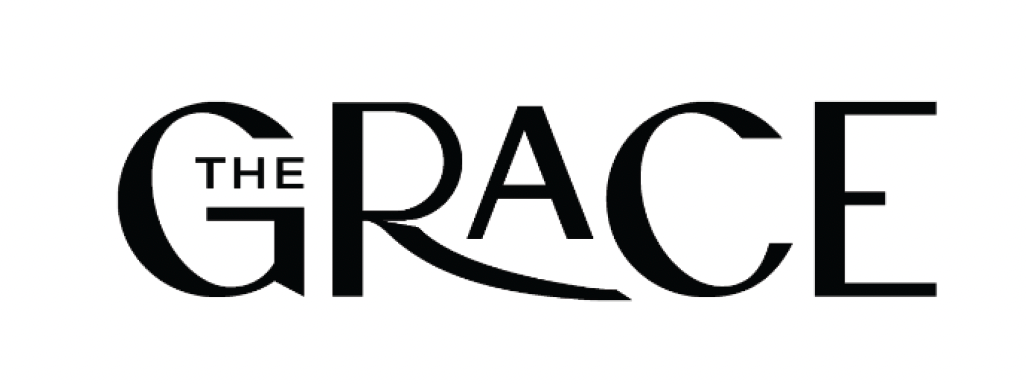
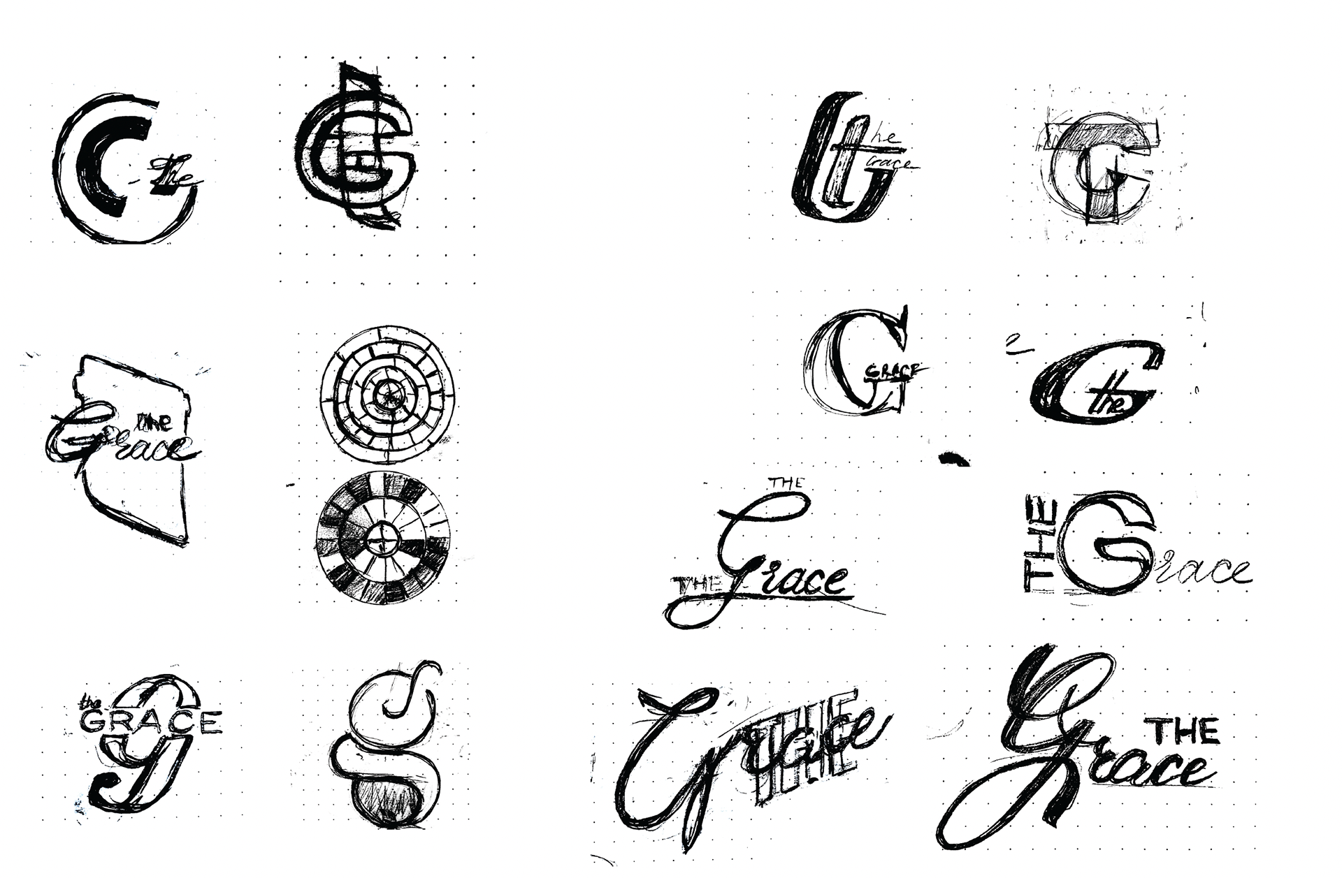
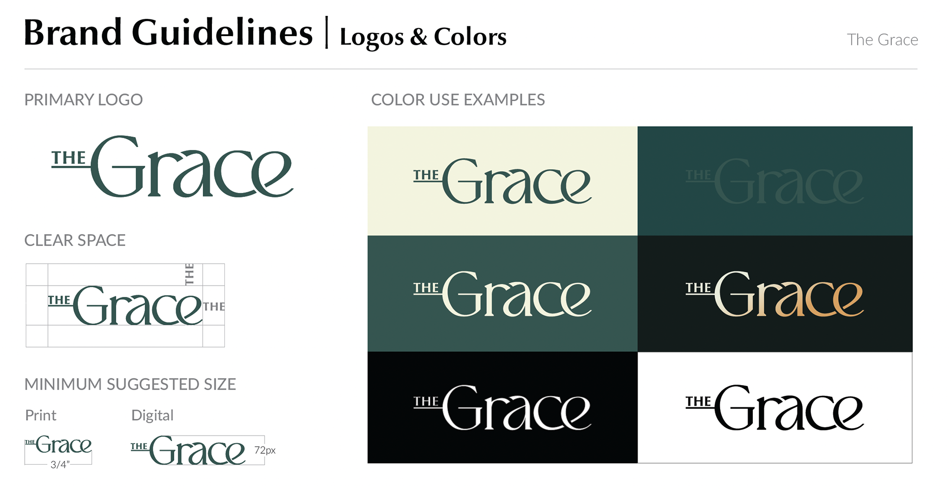
Branding an apartment community presents a unique challenge because there is no tangible product to define the brand. Instead, the identity needs to communicate the experience and qualities the community hopes to be associated with. For The Grace, the name provided a strong foundation, with the goal of developing a visual identity that felt elegant, welcoming, and community-forward.
Typography became the natural direction to explore, with the challenge of making a typographic solution feel both distinctive and ownable. Subtle interactions between the
letterforms create moments where they appear to connect and flow into one another, almost like members of a community coming together. These details give the typography a soft, cursive quality, bringing warmth and a more human feel to the brand.
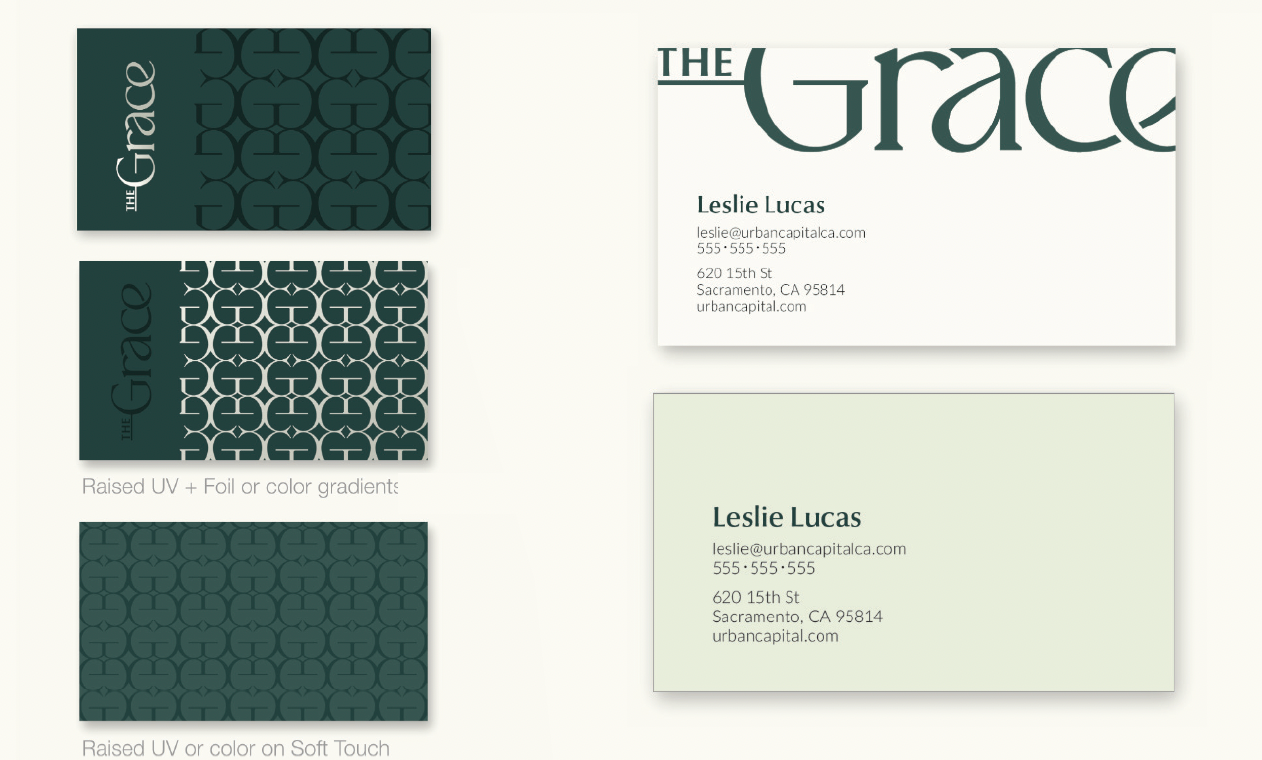
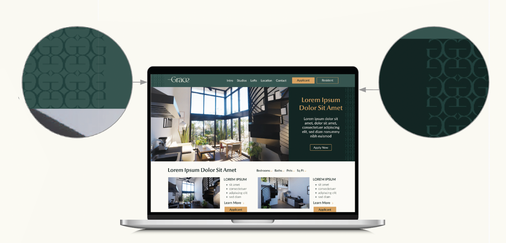
To further elevate the identity, a custom pattern and soft metallic gradient were introduced as supporting elements. Together, these details create a visual language that balances sophistication with warmth, reflecting a community that feels both refined and inviting.
The work on the project was done as a part of a larger team, where I was tasked with concept development and brand expansion.
_________________________________________
Esperanza
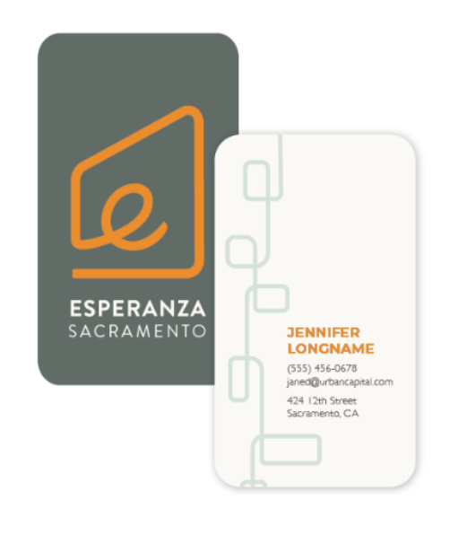
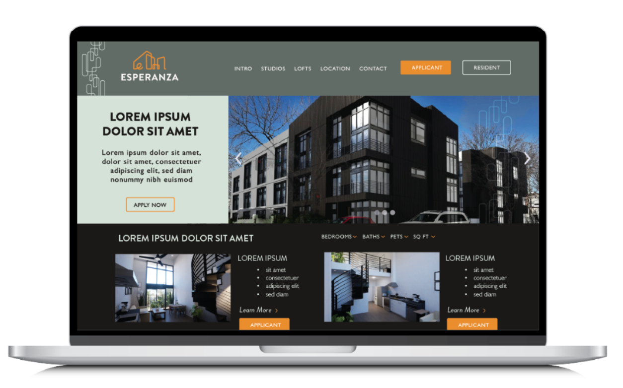
Esperanza is an apartment community in the heart of Sacramento, designed to appeal to a young, artistic, and vibrant community. The client wanted to explore a logo mark rather than relying primarily on a wordmark, creating an identity that would feel more distinctive and memorable.
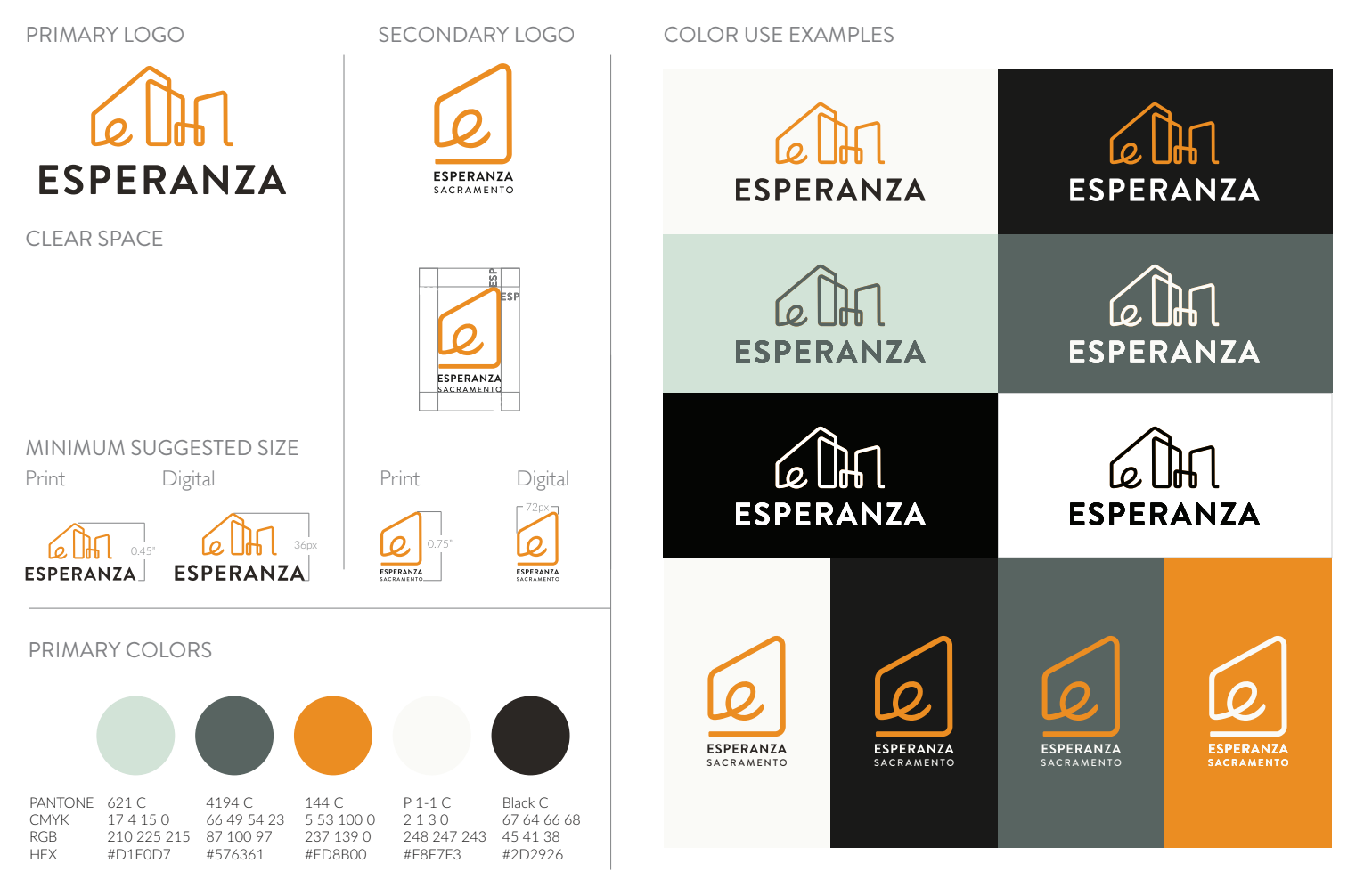
The architecture of the building immediately stood out as a natural source of inspiration. Through exploration, the concept evolved into a continuous line forming a lowercase “e” at its core, creating a mark that feels both
The architecture of the building immediately stood out as a natural source of inspiration. Through exploration, the concept evolved into a continuous line forming a lowercase “e” at its core, creating a mark that feels both
connected to the property and visually ownable. The simplicity of the linework gives the identity a fresh, contemporary quality while making the mark highly versatile across different applications.
The logo also became a foundation for other elements of the visual system, including a custom pattern derived from the same linework. The color palette was inspired by the tones found throughout the building’s interiors, creating a visual identity that feels connected to the space itself.
The logo also became a foundation for other elements of the visual system, including a custom pattern derived from the same linework. The color palette was inspired by the tones found throughout the building’s interiors, creating a visual identity that feels connected to the space itself.